The trouble with sampling data

Well it is that time of the month again. Yep, the UK has just released it’s official figures on the number of people who are employed. Apparently the jobless total is now at 2.5m for the first time as the political commentators keep telling us. The Guardian has a very nice section on their website that deals with the data so that you can see how it has been going. It’s great to be able to build your own mashups.
Why am I mentioning this? Well last month in his weekly column, Ben Goldacre pointed out that these figures aren’t statistically significant and that the increase could just have been statistical noise. Have we learnt from this? Well it appears not because the official Office of National Statistics points out that:
The difference between the adjusted LFS and WFJ estimates (351,000) is within the bounds of the sampling variability of the difference. The approximate sampling variability (95% confidence interval) is roughly ± 300,000 to ± 400,000 (based on the estimated coefficients of variation published on page 83 of the Final Report of the Review of Employment and Jobs Statistics).
Whilst this is pointing out the difference between two sets of data, it also raises the point – unless the figures go up by 300,000 each month, then it is possible that any month on month change is just statistical noise.
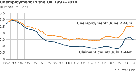
This is why it is important to look at the statistics over time. Look at the data on the BBC:
With this graph we can clearly see that the numbers are going up or down over time. A one month change of a square up or down could be within the realms of statistical significance. By taking a two month average you can see that you are going increase the precision because the sample size is bigger (remember my post about statistical significance?) because you’re ending up with a group of samples. Obviously a three month average gets more and more precise.
So this brings up the next question – why are we looking at sampled data here? Well it turns out that the Government doesn’t really know the number of people unemployed because it’s based on a couple of guesses. The claimant count – well that is a real figure. The Unemployed figures are based on a number of other factors including how many people are self employed, how many have two jobs, how many people are working abroad and how many non-UK people are working here which the Government simply doesn’t know. So it has a survey to find out.
House Prices
Another area where you are going to see samples is in house prices. Here is a nice report from the BBC showing you how much houses cost according to Nationwide and Halifax. It uses the preferred method of year on year change because house prices are seen to be cyclical. You can even look at the Guardian’s year on year changes for those two and the land registry.
Yet we still have reports saying:
House prices fell by 1.2% in August, according to the latest Halifax index, ending three months of price rises.
So why am I including these figures in a post about samples? Well it turns out the figures here are samples as well. The Halifax and Nationwide only produce figures on houses where their mortgages are used. Even the Land registry version is slightly limited because it is based on matching up data from different years for the sale of the same house. Really this data should be reported with error bars.
Inflation
Inflation is a term that’s coined to talk about the increase in the price stuff costs. There are two favoured choices of how to measure it: using the consumer price index and the retail price index. How do they work? Well they both work in more or less the same way, one of them has a list of commonly bought stuff and monitors its price in shops over time. The other one is the same but with houses included as well.
Firstly you can’t measure all the stuff that is on sale over time. New stuff comes on sale so frequently that the list would just get larger and larger. Plus some stuff you buy more frequently than others. I buy apples virtually every week, but I buy toilet bleach about once every six months. So the list takes all of these things into consideration and changes on a regular basis.
What that means though is that the data represents the sort of stuff that people buy, but if lots of people get made unemployed then will that make people buy fewer things? Will the list of stuff that people buy be smaller and hence affect the measure of inflation? Suddenly it doesn’t look so ridiculous to start including error bars on the inflation values. Not least of all because the head of the bank of England has to explain every month why it is above a certain level.
Samples
Which brings us to an interesting point about samples. They exist in so many different forms of life’s data that we need to think about it all the time – especially when looking at whether data is accurate or precise. So if you’re planning survey data and you are going to be taking samples you need to think about the following when doing your analysis:
- Seasonal changes in the data – this will affect whether you do year on year, month on month, or even three month moving averages over time to see the difference
- What bias is introduced into the data because of the sampling – even full data sets sometimes don’t include the entire population
- What is the sample size – smaller samples will be less precise than larger samples
- Has any normalisation been added to the data – whilst this may seem like a good idea, it may mean that one sample is not quite the same as another one decreasing your precision
- Is the result of the sample the data you need – your sample may be asking the wrong question giving you the right answer but not to the analysis that you’re interested in
- Correlation does not equal causation – just because your data says that two things happen at the same time it doesn’t mean that one caused the other


Leave a Reply