Microsoft Analytics has had an overhaul
Actually, the headline is a bit of an exaggeration. Microsoft Analytics hasn’t really had an overhaul, but has had a bit of a revamp. You may remember my previous posts on the subject where I first reviewed Microsoft Adcenter Analytics compared Microsoft Analytics with Google Analytics. Well now the kind people at Microsoft have decided to update the functionality and features, so I thought that I would run through them for your benefit (although you can view them with a different slant on the Microsoft adCenter Analytics blog).


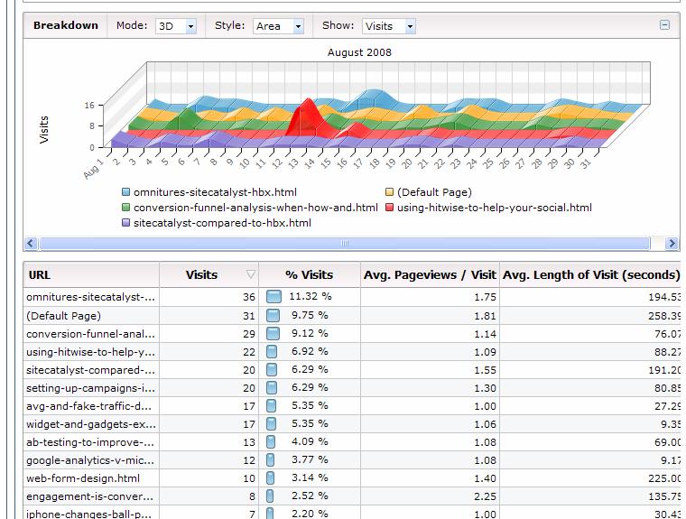
The next area of improvement is the introduction of path reports. These are very clever as they will allow you to work out how people navigate through your site. More importantly, they’ll allow you to do a couple of things:
- Work out where people are going to from a particular entry page (this is good for not only next page reports, but working out where they go after that – it’s all about persuasion architecture)
- It will allow you to work out how people are navigating through your funnel to see if the process is obvious. In blogs we don’t really have funnels, but this isn’t the case in commerce sites where there is a check out process
- For a frequently viewed page that isn’t high on the entry page list (see the next bit) then you’ll be able to see how people are getting there (this should enable you to work out why and whether you want them to or not).
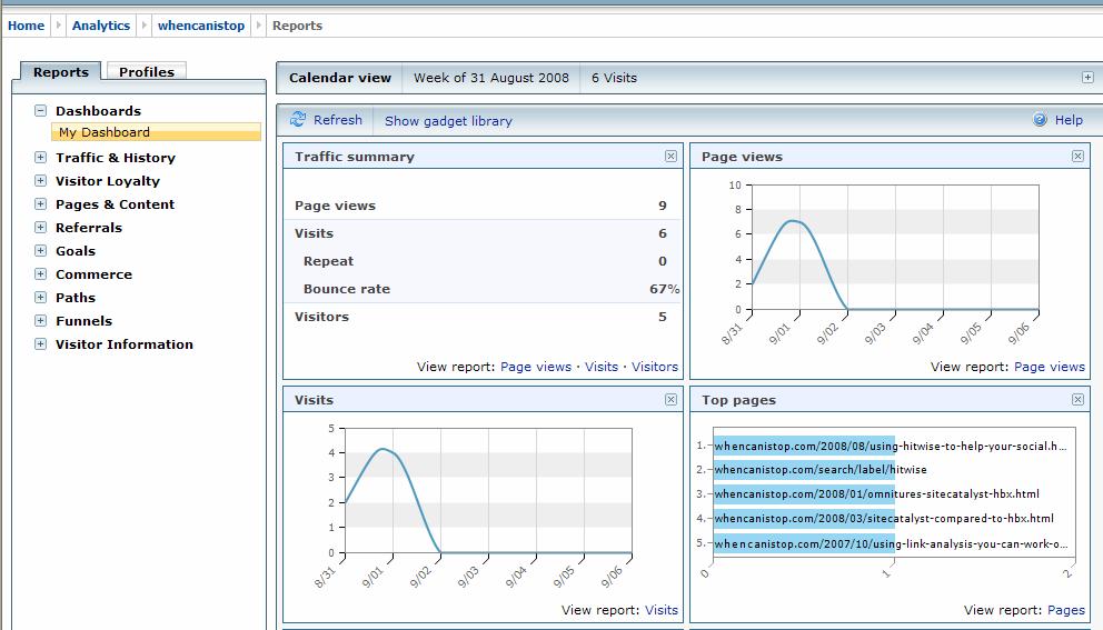
Entry page reports are some of the most useful in the business. They tell you where your users are arriving at your site. The report that Microsoft have added would have been a bit more useful if they’d had the bounce rate on this as well (although you can still get that info from the pages view, which breaks your content down into groups based on the url structure). You can of course, get the same exit page reports.
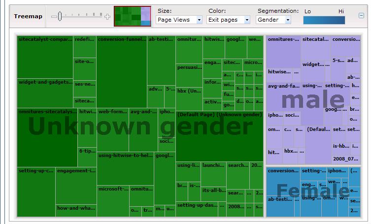
The main USP of Microsoft Analytics was always that they could conjure up all this data about you from your .net passport. And this has now been introduced into more of the graphical reports. Last time I noted that I like the tree map view as a new visualisation technique. Now they’ve added the ability to segment by your tree map view by each of these segment (age, sex, occupation). There does still seem to be a lot users on my site that aren’t logged in (see the chart below), but I think having this data does give you that extra little bit.
Overall a few nice improvements that they’ve made. I’m looking for them to continue to update this to try and compete with Google. I do also think that they’d benefit from encouraging people to blog about using it – there are hundreds (if not thousands) of Google Analytics blogs, but few about MS Analytics (bar their own). Don’t ask me how they do this (maybe they need to employ an evangalist like Avanish Kaushik did for Google).
Hello Alec – Thanks for letting your readers know about the new features. We’ve had some great feedback and will be adding some new bits and bobs in the next few months. Keep an eye on http://adcentercommunity.com/blogs/analytics
I was just at SES San Jose talking to people and will be at ad:tech London later this month.
Maybe see you there!
Hi Mel,
Thanks for your comments. It looks like I was wrong and there is someone who is being an evangalist about it. I hope to see you at Ad:tech in London later this month.