The rules of engagement
Ok, I’ve talked about Engagement before on this blog (twice actually), so I am not going to repeat myself. There are a number of measures of engagement that you can use and these are detailed all over the place. My favourites are always:
- Percentage of visits lasting more than one page
- Percentage of visits lasting more than one minute
- Percentage of visitors visiting more than once
Obviously you can segment the first one by looking at groups of pages – this is easy in the Page Analysis summary of HBX, because it gives you your entries and single access for all your pages. It’s then easy to search for your content group.
Well we’re looking at the measures of success of our redesign of ComputerWeekly and although we can measure all those things that we’ve talked about earlier, what we really want to do is look into what we can measure in terms of the design and in terms of changes we’ve made. Then we’re going to look at what we can do to continue the improvement.
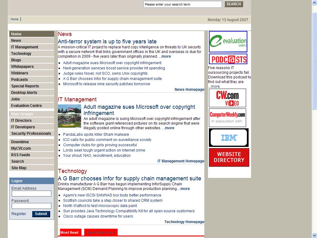
I always think the best places to start on these things is to look at the old versions of the page and then you can work out the changes you’ve made. So here is the old Computerweekly:

Well as you can see in the old style left hand nav, we’ve got a series of options that basically have just grown over time and then eventually most of the navigation is hidden away under IT Management and Technology. That’s ok, because if your users have been on the site since inception, then they’ll have seen the gradual change and know where everything is. The problem arrives when you spend lots of time and effort getting your users deep into the content and they may not have seen this navigation before. So here is the new one (and we don’t forget how we came up with it):
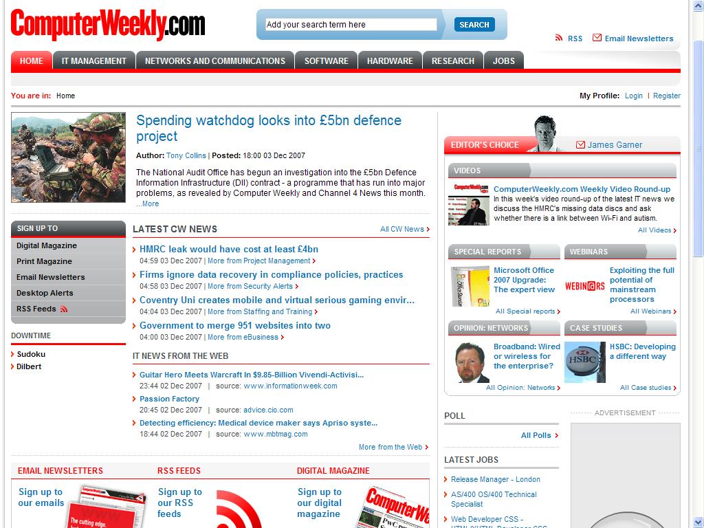
Well the difference here is the top navigation, but one of the interesting things we’ve discovered about these pages is where people have clicked on the page. This is where you need to get your active viewer out and have a proper look. The thing that surprised us is that the users liked clicking across the top of the page, using the nav links, but also on this page are the clearly defined sign ups in the left hand nav. I thought that the online audience wouldn’t be at all interested (they never seemed so in the old navigation where we included links to personalisation and offline products). What we need to look at is whether one of these is or isn’t getting the clicks we think it deserves, based upon our persona research. Then we can try renaming, replacing or moving to see if it has the impact we desire.
The next thing that we need to look at is the articles themselves and what our users click on here. I’ve split the page up into a couple of sections, like you might do in a wireframe and of course I had to choose an article about e-business:
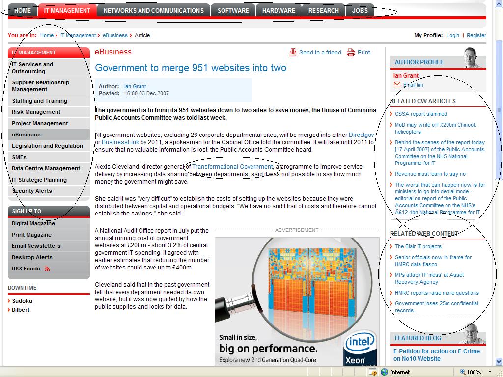
- Top Navigation – this is here for consistency, but we need to work out if articles are classified in the right sections, so are the users clicking out of these sections into others, can we use that to help related content
- Left Hand Nav – this supplements the main navigation and can help to show which sections users like in terms of preference to give an order
- Right hand related CW content – these are articles that we’ve deemed to be related – if users aren’t clicking on this, we need to work out whether it’s because of our classification rules or because it’s not prominent enough
- Right hand related web content – this is really dangerous (and political). You’re linking to other content so users may leave and not come back, however they’ll remember your site and come back. If this is clicked on too often it may be that we’re not creating enough related content
- Contextual links – all research points to these links being the most clicked on. However they have to point to relevant links (relevant to the user, so work out where you think they are going to come from to get to the article before putting them in), with relevant anchor text.
This all needs to be looked at in context though. Prioritise which areas look like they need the most work first, work out ways to change them and use your agile programming to make lots of small incremental changes. Then measure them to see if they’ve worked.
Leave a Reply