Launching a new site
Well I had to talk about it at some point, so now is as good a time as any. Computer weekly has just had a major redesign (launched at the end of last week) and I am going to talk about how the redesign process worked and why we did it. Just to prove a point though – we aren’t the only ones to have a redesign, the Guardian have just had a relaunch where they have changed the home pages one by one. Interestingly I was intrigued by the blog on the Media Guardian where the users gave their impressions of the new site. It’s unlikely that those that liked the site or thought it was ok would have mentioned it on the blog though, so I’ll give them the benefit of the doubt. I’ll continue with media theme by pointing out that the Sun also changed their site recently – mainly positioning it around the MySun section which has been doing well (apparently) , even if it is still impossible to find any of their content on Google.
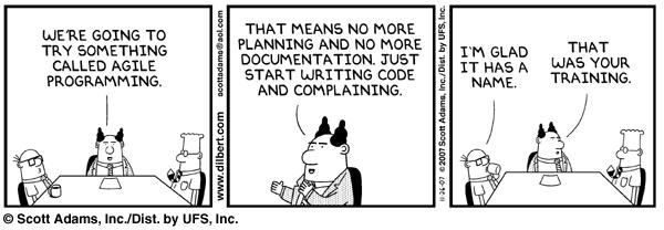
Anyway – lets go back to Computer Weekly, because I know something about their redesign, whereas I don’t know anything about the others. It all started a long time ago, actually, where we got a group of ‘experts’ to sit down in a room and attempted to come up with some ideas of what they could do to improve. This process involved not only looking at what our users were doing (using web analytics tools) but going out and asking them (user research). We also went into the depth of the content and categorised it in a more effective way, worked out what our key search terms were and built a content creation concept that would allow the content on the site to be found. Also we wanted to do the whole thing in an agile way.

Ok – I jest, but seriously agile is a system where all parts of the project were broken down into small steps which we could then complete in individual ‘sprints’. Although our whole UCD approach maybe went in a slightly different direction, but the theory stands (even if we didn’t release it all at the same time).
Well the first step in this process was to create some baselines and work out where you need the most focus. Well for Computer Weekly this whole process was much easier than anticipated – they had a broad understanding of the site and how it all worked in the first place. With media sites it is very important to look at the first touch points of the user and then work out where they go from there (or not). Whilst we have known for a long time that homepages are not the be all and end all it’s amazing how when you delve down into the stats you realise how little it is. But that doesn’t mean you can ignore it, by the way.
So the next step in the process is to do some user research. This is important. If you don’t know what your users think of your site, then you won’t have anything to baseline it against. The next step of user research is to create personas. This isn’t as scary as it sounds – you are creating a small group of users to your site that represent them all. Your personas should tell anyone reading them about a group of individuals that look at the site, why they are there, what they like, how web savvy they are and what we want them to do on our site. This last bit is important – and should come out of the concept model for the site.
Whilst this process is going on, you have your information architect look at the site and work out the best way of categorising the content on the site together. This is difficult for Computer Weekly because there is a lot of it and you may already have some preconceptions based on the current site. So this is also helped by use of the concept model – if you know what sort of content you are going to create in the future, it is far easier to create the categories. Working these into a set of rules to set this up automatically is the difficult bit.
Then we need to bring all this back together and build some wireframes. These are critical because it means that you are not wasting lots of time and effort (read: Money) building real alternatives as pages for you to test with users. And this is the next step, test them with the users – because if you want to know which option is best, then the only way of checking is to ask some users.
This whole process of building, testing with users, building a bit more, testing with users again, ad infinitum means that you end up with a website that is truly user centred. Not only is it user centred, but it is now also garnished with a lot of links that are about the same subject, giving you a nice ‘aboutness’. Given some good SEO work (technically and looking at those search terms that are driving traffic), you will also end up with an audience who are looking to engage more with your website. Which is probably a good place to start next time.
Excellent post Alec. Great that you condensed 9 months work into such a concise run-through. Just a mention here that the agile methodology helped only so far in this instance, such a radical redesign and restructure will never be handled by agile methods alone. Big bang launches are still relevant for certain projects. If we can get the clients to not only focus on the time and budget, but also the user and quality of their experience, then we can start getting somewhere…