Conversion Funnel Analysis in WebTrends
Conversion funnel analysis is so 2008. But I’m in a retro mood, so we’re going to revisit it again, this time updating the series to show how you do conversion funnel analysis in WebTrends. It is quite worrying actually that 2008 was when I wrote my original post on Conversion Funnel Analysis: When, How and What. This was the definitive guide on how to do conversion funnel analysis back in the day.
Of course you all lapped it up making it the most viewed post in the first five years of this blog, which is why there were follow ups for how to do funnel analysis in Omniture SiteCatalyst and how to do funnel analysis in Google Analytics.
Webtrends funnel analysis tool is called Scenario Analysis (there is a great three part series on it by Sandra Elliot on the WebTrends blog – albeit on version 9, not the latest version).
The fact that version 9’s scenario analysis takes up three blog posts to describe how it works suggests that it was overly complicated, so I am going to focus on what it looks like in version 10. But before we get there, lets revisit the point of conversion funnel analysis.
Why do Conversion Funnel Analysis
Conversion funnel analysis is what you use to work out why you aren’t getting enough people to your conversion point. If you can identify where people drop out of the process you can make changes there to see if you can get more people to the end.
And if you think that there aren’t changes that you can make to get more people to the conversion point, you’ll know how many additional visits you need to pour into the top to get those additional conversions.

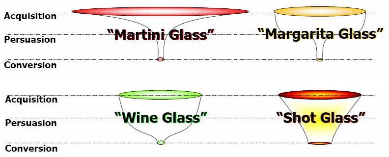
Depending on your funnel type, will depend on where you should be focussing your efforts of making change. Whilst we like to visualise them as types of glasses that you serve alcohol in, the realisation of what causes each, will allow you to make a change to get more people to the end.
Scenario Analysis in WebTrends
In WebTrends they have a visualisation of the funnel analysis that allows you to work out where people drop off.
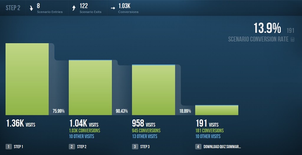
Here we have a four step process that shows where people are dropping out of our site through to a quiz download.
What’s the important information in this picture?
13.9% represents the number of visits at the last step divided by the number of visits to the first step. I worded that very carefully, you might have noticed – I didn’t say 13.9% of the visits in the first step converted. What is the difference you might say?
The difference is that some of the 191 at the final step might not have hit step one. Here we have an intrinsic failing of the conversion funnel – frequently there is no ‘path’ that the user has to take through the site to get to the end. And even in cases where there is a definite path, there are frequently branches that go off in one direction or another that can distract the user.
Anyway, going back to the report that you were looking at. There is a nice line at the top of the report that allows you to see for a step how many entered the process at that step. This will allow you to work out some of the reasons why you are getting more visits in a later step than an earlier one (in version 9 you can see where they came from).
There is also a drop off percentage for each individual step. In the example that you can see above it does actually work quite well as a path, but the major drop off is whether people download the final summary or not (in actual fact, the download is a conversion point, but we’re actually also interested in step 3 as well, because this is the end of the process).
What should you do with these reports
These reports are there to give you insight on ways that you could optimise your site. They suggest where the drop off points are, but they won’t give you the answers. The only way of getting the answers is to ask you users or by testing.
The other advantage of this report is that you can test things by making changes and see what the impact is on the drop off points.
The other thing that you need to think about from this report is whether you are getting enough visits in at the top in the first place. This is where you can analyse whether your marketing is working as it should be (although I think this could be improved by WebTrends).
Leave a Reply