5 Tricks for better SiteCatalyst Dashboards

About a year ago I wrote a post on the new Omniture SiteCatalyst Dashboards. This time around I’m going to give you a few hints and tricks of things that you can do to make it all work a bit better. I have been expecting to write about SiteCatalyst version 15 at some point, but there haven’t been enough people who have moved to it yet, so it is going to have to wait. You don’t want to read a post with examples from a dummy account, do you? In case you were wondering, the dashboards in SiteCatalyst 15 are the same as in version 14. Obviously with the added improvements of things you can do in the normal reports. So lets get going.
1. Put your company logo on the reports
Ok this isn’t going to make your dashboards more useful in any way possible, but it does make them look more professional.
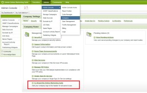 |
| You don’t have to have an Adversitement logo |
The more professional your reports the more likely the management are to listen to the recommendations that you make because of them!
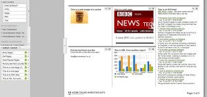
Want to go a step further? Why not put a front page on your reports with your name on it so that people know to contact you in case they get stuck. That is easy too because you can add text and images to the front of reports!
You can add in images, text, html pages, RSS feeds and XML feeds so you can customise your pages how you want. If you’re going to have a front page to describe your dashboard, you might want to include stuff that will work when it gets published out (which the HTML won’t). You can also upload images for free to Flickr to link to for these reports.
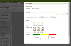
2. Add Gauges
Ok this isn’t really adding some specific data to your report either, but it does allow you to present it in a way that will mean something to your management. It is adding that vital ingredient of context.
So what do you put in as your maximum and minimum values? Well you have a couple of options:
- Put in your average monthly targets as a top target and 90% as your bottom target (or put in your target as your bottom one and 110% as your top one)
- If you don’t have targets, why not put in your highest and lowest values from the last 12 months – this gives nice context as to whether it is within a range or doing better than expected
These targets are for your standard metrics and your custom events, but they are also for your calculated metrics as well. If you want to show how your conversion rate is doing then this is a very good way of showing it.
The downside of these reports are that they are only for metrics – you can’t have a split down for the values of one of your variables (eg you can’t have conversion from a particular referring domain).
3. Have two graphs
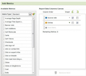
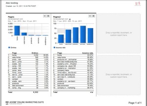
When you set up your reports you quite frequently want to have your graph of two different metrics, but they aren’t in the same scale. For example how often have you wanted to have your entries for a page and bounce rate on the same report, but because bounce rates are so much lower than entries the thing looks ridiculous and you can’t see the difference of your bounce rates per page.
The annoying thing is, if you create two graphs on the same report then you end up with an annoying situation in your dashboard of only one graph (unless they are pie charts – but that isn’t appropriate in all situations).
So your solution is a bit of an annoying way around of creating the same report twice in your dashboard. Do it how you would do normally for just one metric. Then when you come to add your second metric, you need to leave the first metric in your report, but put it at the bottom. Then move your first metric to your right hand graph, but make sure that you are still sorted by the first metric (like so):
You might have to alter your report again to be sorted by entries once it has loaded (why does it do that? Why bother asking if it then doesn’t pay attention to it?).
Now when you add to your report they’ll be in the same order as before. This is important because you don’t want your top pages and your top bounce rates – they won’t match up.
4. Copy your dashboard to another report suite
So you’ve got two websites being tracked through Omniture. The websites come out of the same template of your CMS, so you’ve done identical SiteCatlayst implementations on them. That’s great, it makes your life a lot easier. It makes it a lot easier if you’ve created one report that you want to replicate in another report suite.
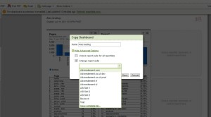
So it is as simple as clicking on ‘More Actions’ and then ‘Copy Dashboard’. When in this menu you should choose to change the report suite and you’ll be given a list of them all!
As a little aside to this one – you can quite easily change your reporting cycle at this point as well. If your reports are set up to be monthly reports then you can copy your dashboard to be identical and then change your date rang. Remember when choosing the date range that if you choose ‘last week’ or ‘last month’ from the drop down then the reports will roll over at the end of each month/week. If you choose a particular date range using the free form boxes or by clicking on a date then your date ranges will roll over by a day every day. You probably don’t want this.
5. Use Classifications to get better graphs
Classifications are useful ways of transferring one variable that has no meaning to the average person to another with a sensible name. I’ve written about how to do SAINT before – it is really, really simple.
But the other way you can use SAINT is to help you create graphs for your dashboards that would normally have been unavailable. For example one client had split out the different types of a conversion in an eVar so that they could easily report on each type. It turns out that the ten different values related to two or three different types. We classified these into the three different types so that we could turn them into a graph.
The other option you can use for SAINT is the rather useful ability in Excel of turning text into columns. This is especially useful if you have set up, for example, your page names to be ‘Site Section : Page Title’. You want to have entries and bounce rate of your site sections, so you can export the list into excel, use text to columns with your colon as your delimeter.
Another clever way of using the classification is to create a line in a graph that is ‘everything else’. An annoying state of SiteCatalyst is that it doesn’t have this option. But you can create it using SAINT. Remember that you can only have five values in your graph, so if you are going to have an ‘everything else’ you need to classify into just four others.
So there you have it. Have I missed out the golden egg that you’ve been using all this time?

Hi Alec – great post.
I’d add 2 things, that I encourage my users to add to their dashboard.
Using the compare dates functionality – makes it easy to show top pages/channels this month vs last.
Using Targets. While these can be a pain to maintain, they make very effective dashboard images. Clearly shows if site expectations are being met.
Ross.
Hi Alex, great tips. However I don’t think the dashboards in any web analytics tool are up to scratch. Instead I would recommend exporting the data into an automated Excel dashboard that is customised to business requirements.
Cheers
Peter
Hi Ross – thanks for the comment. Targets I definitely agree with you on – it’s another way of presenting your data with context.
I was just talking to someone the other day about my frustration with the way that dates work in SiteCatalyst. It’s all well and good having a ‘last month’ which rolls over every month, but if you want to do a comparison between last month and the month before you’ll need to reset your dashboards each month!
Which brings us to Peter’s point! Sometimes it is better exporting everything to excel (or loading it in there in the first place using Excel Client).
However Dashboards definitely have their place. For those that are too lame or lazy to do it themselves, you don’t want to waste huge amounts of time playing around with reports in Excel to get them to the right place and then sending them off yourself. A degree of self-service is always needed when your time is tight, plus automation always helps for when your ill or, heaven forbid, on holiday when your stakeholder wants a report.
Cheers,
Alec