Four ways to make use of the new Google Analytics interface
This is my first post for a while on this blog, but I have mitigating circumstances – I’ve just come out of hospital having had some knee surgery. You’ll be pleased to hear that this hasn’t stopped me making bad puns, ridiculous comments and writing about stuff that has been going on recently. This week it was pointed out to me that there is a new version of Google Analytics that has come out. Dan Baker has a very good overview of the changes. Just to point out before going through the whole post, the change is mainly just a facelift – most of the stuff in Google Analytics is the same, it has just been presented in a different way.
In fact, it is interesting to note that with SiteCatalyst 15 coming out recently (more on that soon in the coming weeks – in the mean time here is a link to the 6 things that I thought should come in SiteCatalyst version 15) that the two tools are starting to converge towards each other. It’s almost like they are copying each other’s features as Google attempts to make its data presentation better and SiteCatalyst attempts to make its segmentation better. I suppose it was inevitable really – one tool recreating the best features of the other.
So let’s have a look at it:

So it effectively is a bit cleaner looking and brings some of the features that they’ve added to the tool in the last couple of years to the forefront. And it’s those features that they want you to use more because it’ll give you that little extra in the fight to make more money from your website (or whatever it is you want to do with your website).
As Dan says in his blog post, for the ‘power users’ the left hand navigation is mainly the same, but it makes it easier to get to the reports because you don’t have to go through each topic heading to get to them. For the ‘basic users’ the groupings should make it easier to understand and they may make more use of the reports.
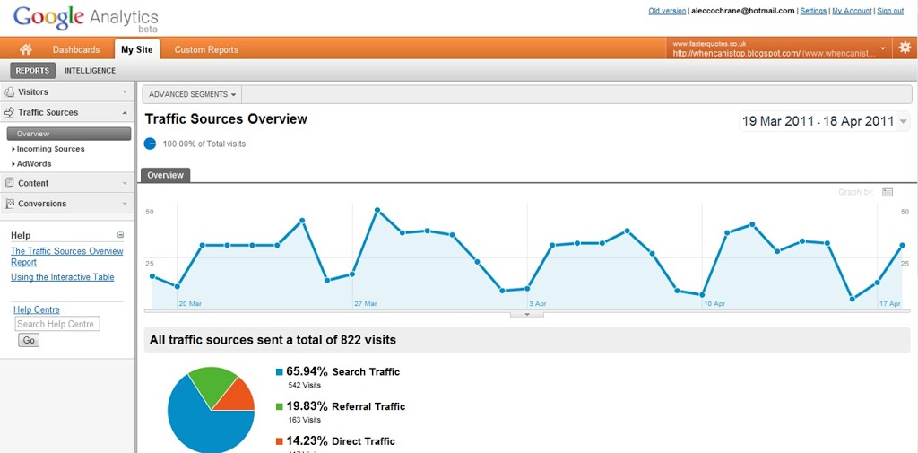
Advanced Segments
Advanced Segments have been a staple of Google Analytics for a while now. Two and a half years ago I wrote about the new features of Google Analytics, of which advanced segments was one of them. What Google are attempting to do by putting these at the forefront of the new tool is to give the users as much use of them as possible:
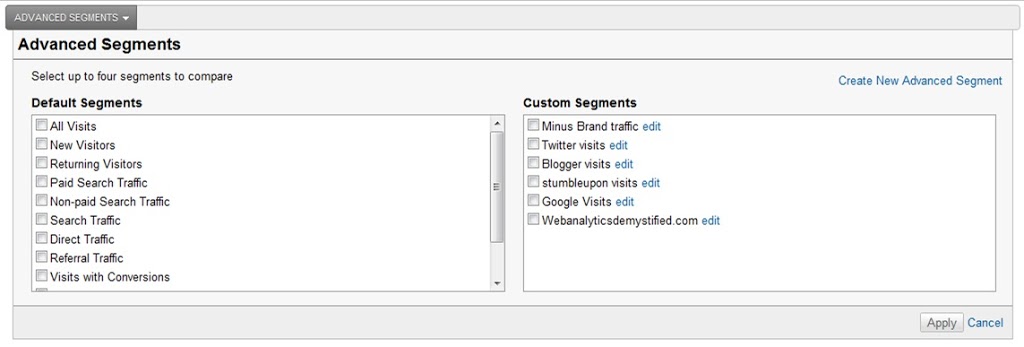
By putting them as the main headline link, they are showing that you can do much more with the reports than you originally thought you could. As long as Avinash continues to shout ‘segment, segment, segment’, this will be given more and more prominence.
Previously the ability to create your custom segments was hidden away at the bottom of the left hand navigation in the middle of the help section. Now it is bold and bright when you put your segments in.
Custom Reports
Two and a half years ago I also wrote about custom reports when talking about the new features. Now these custom reports have been thrown in at the deep end, albeit with a bit of an upgrade to them. Personally I quite like the way that you can now build your reports:
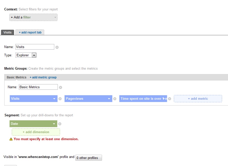
As a ‘super user’ I also like the way that I can now add these custom reports to any of the different websites that I manage. In this case it is useful if you have created profiles for your website including, excluding or having different versions of the traffic. It makes it much easier to create custom stuff.
The other interesting thing about these reports is that you can add a tab on to the top to create a series of custom reports with lots of different pages. It is a bit like the advanced dashboard creation that you can do in SiteCatalyst.
One of the nice things about the custom reports is that you can apply your segments to them at the touch of a button because that advanced segmentation is still at the top of the screen. The downside is that you can’t default this to be on with the report. What you can do though is apply a filter to your custom report. These filters work a bit like your segments, but with a bit less functionality.
Dashboards
The dashboards in Google Analytics have always been a bit rubbish (sorry!). Mainly they are used as a starting point for your reports and then you can move into the report when you want the actual detail when you want more than five lines of detail. The new dashboards are a little different as they are a little bit more customisable.
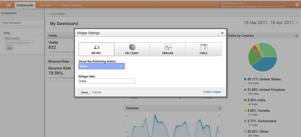
I hasten to add they’re only a little better, but mainly because it is easier to customise them. The limit of your data is still quite high. In all probability, you will use the custom reports more than you’ll use the dashboards.
So with the new dashboards you can have pie charts with up to six slices or tables with up to 10 rows in them. You can also add in and sub out whatever you want to make it a bit more useful. You can also create a few more of them and have them as something that you give to senior managers as the quick overviews.
The downside is that there is not yet the ability to export them, they are just screens that people can see. The other disadvantage is that you can’t get the advanced segments on them as you would wish them to be. This is a bit of a shame, but hopefully it will be coming in a future release (it is still in beta at the moment – even if most of Google’s products never make it out of beta).
Intelligence
Intelligence is something that Google has had for a while and used to be mixed up in the left hand navigation. They have now moved it out of the left hand navigation to the top navigation on its own, because it is more of a functionality than a report type.
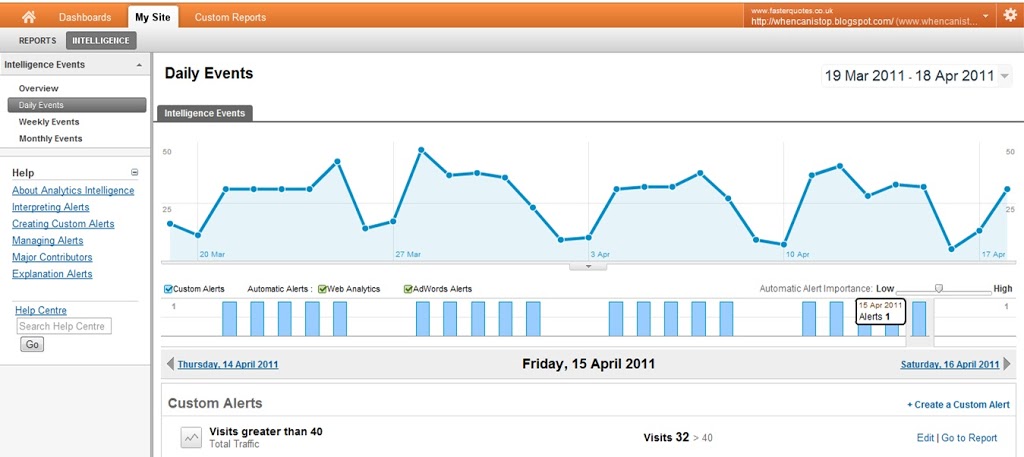
I’ll point out now that the alerts that these give out tend to be about as much use as Google Alerts. Maybe they are run on the same system. Needless to say mine are usually late, don’t really bear much relation to reality, but the idea is really good, so I really want them to be better.
The trouble is the same as SiteCatalyst alerts – essentially you don’t get them until it is too late (the beginning of the next day/week/month). So if I have a spike in my traffic I want to know now that I am having a spike in my traffic, not wait until the end of the day. I have a chance to be able to do something about it now, but tomorrow it may be too late. The buzz has gone and I’ve missed out.
Having said that, there are things that knowing the next day might be of genuine use. For example if you want to know if your adwords have run out of money, then it is very easy to do this on a next day basis. It is also useful if you want to find out when you hit a certain number of conversions so that you can do some capacity planning for your warehouses – set up an alert for 10, 20, 30 and 40 sales in a month, then you’ll be able to do something about it.
So there are four quick ways of making a win out of the new Google Analytics interface. What are your favourite features?
Leave a Reply