The last couple of weeks have been quite hectic for me because we have made some changes to our implementation of Omniture on our site and so there has been a lot of testing. Fortunately the release seemed to go ok during the beginning of last week and we have a more advanced data capture set up. Interestingly it seems that it wasn’t just me making changes, Omniture also decided to up the ante and make some changes to their tool as version 14.7 was released on Friday last week. Fortunately it turns out that many of the changes coincide with some of the things that I’ve been doing. I’d like to say that it was clever organising by me, but actually it was just a bit lucky.
So one of the major updates for me was the way that Omniture works its dashboarding capability. And having mentioned dashboards before when I told you
how to build dashboards in HBX and
how to build dashboards in Hitwise, I’m quite surprised I’ve never done a piece on how to build them in SiteCatalyst. So here you go. This is it.
How to build a dashboard in Omniture SiteCatalyst.
The first thing you should remember when building a dashboard is that you don’t build standard dashboards for everyone, if you can avoid it. Why? Because
you don’t have standard reports in Omniture. Seriously, you don’t. What you need to do is go through the theory of
what it is that you want to get out of your systems and then create your reports to be bespoke to that. If it turns out that you need more than one non standard report then you would go far worse than creating a dashboard out of those reports – just so that they are in one easy place to navigate to or export, depending on what you want to do.
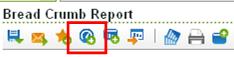
Having found the reports that you want to include in your dashboard, the next step is to click on the button at the top of every report allowing you to add the current report to a dashboard. Don’t forget that it will pick up any filters and drill downs that you have already set up, so make sure these are right first (although you can change these at a later date). Clicking on your button brings a little popup that looks like this:
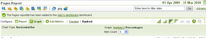
This popup gives you all the options that you need for adding something to a dashboard. Namely it asks you what you want to call your report, which dashboard you want to put it in and if you choose a new dashboard it asks you for a name for that dashboard.
The date thing is vitally important here, although it may not seem it. Preset date ranges allow you to select how your rolling date range should change. If you select last month, the report will always show last monght if you choose a rolling date range. This means in February it will show January and in March it will show February. If you select the month of January without using a preset (eg by typing in the date range or by clicking on the name of the month) then the report will roll over daily (ie if you look at the report the day after you set it up, it will show 2nd January – 1st February, and so on). Make sure you choose a preset date range.
You can also ‘pin’ one of your date ranges to a certain date so that you can count from a time period (useful if you have a graph of something since its inception) or pin it to an end date (eg if you have a marketing campaign that ends on a certain date).
There we go. Done. Added. Finished.
What do you mean that’s not finished? Well go off then and add all of the reports that you want to add to the dashboard and come back when you’ve finished. I’m quite happy to wait. Or alternatively you can do the next bit as you go along and add bits and pieces here and there.
One of the issues with the old dashboards (certainly that I found anyway) was that you added all your items, turned it into a thing of beauty on the screen and then when it got to the point to export it you had to fudge it into something awful. The Excel version of any report was clunky and all in one column, the Word version had bits falling off the screen, there wasn’t an HTML version and the pdf version, whilst being best, definitely had a few issues by trying to make sure that reportlets didn’t fall off the page.
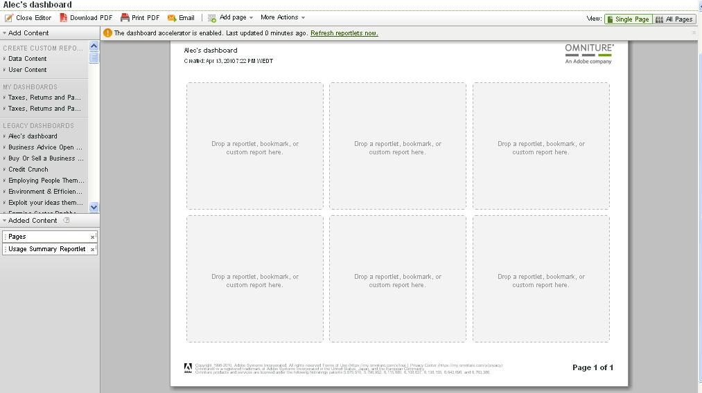
The new dashboards work in a completely different way. No longer are there any excel or word download options and the editor is wysiwyg in the on screen and pdf sense of the word. When you go to your dashboard now, you won’t be presented with the dashboard, but initially you’ll be shown the dashboard editor:
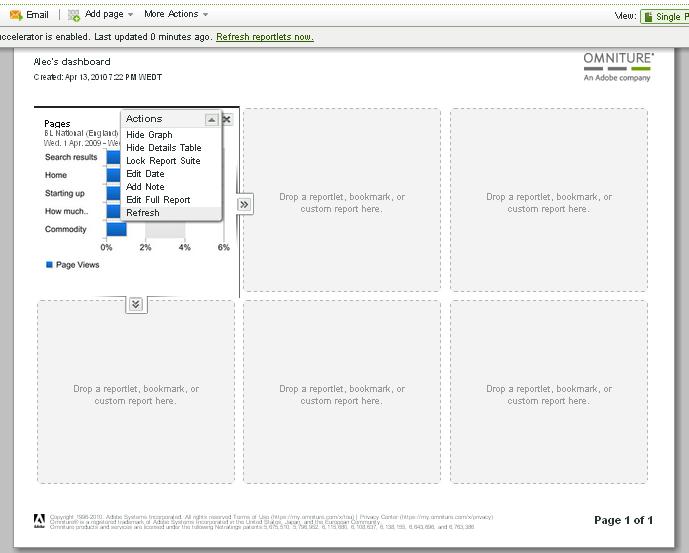
This dashboard editor allows you to build your dashboard as you’d like to see them on the page. You can drag and drop the items on the left hand side that you’ve chosen to add into any of the slots on the page. You can then choose how tall and wide you want the reportlet to be with the arrows to the side of the newly added report:
You can do the same as before in terms of choosing the graph, data table or both (bear in mind for both that you’ll probably need to have a longer reportlet going down the whole of the page). You can then even add in new pages to your reporlet at the top of the screen and do the same for your second page. The beauty of this is that you can also take reportlets from other dashboards and add them in to you current one.
Then when you’ve finished adding in all the things you want, putting them on the pages that you think are appropriate, you can click on the button to close the editor and there it is in front of you. Each of the reportlets is still clickable to go to the actual report. You can then do some editing in the report as before (such as what graphs do you want at the top, how do you want them to appear, how many rows in the data table, etc) and then click on the update button on the top.
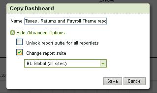
So what about your old dashboards? Well they all still work as they did before, so you don’t need to worry about that. They are now all called ‘Legacy’ dashboards now. But if you go to one of your dashboards and look at it, you’ll see a new icon at the top of the page, next to refresh called ‘copy to new dashboard’:
Clicking on this button allows you to copy your old style dashboard to the new template – thus you can rebuild it in the same way as before. Simples!
There is another feature that I quite like. Previously if you wanted to do the same dashboard but for a different report suite, you’d have to entirely recreate it. Now you can copy the dashboard as before and change the report suite in the process. That is a very nice feature that is useful for us, because one of my changes was to create a new ‘global’ report suite.
The downside of dashboards, in my opinion, is that they promote laziness. Too often people want to have something that is automated. Automated things don’t get read and often miss the commentary that is necessary from someone who has done some deeper diving. If I was going to say one thing to you it would be to persuade people to view their dashboards online. This means that they can do the delving into the data if they notice something that they need to think about.


Nice tutorial of the new SC Dashboard functionality. I agree that there are huge improvements over the legacy dashboard functionality in terms of formatting on screen and for print. However, there’s one thing I miss. I haven’t found a way to update all of the reportlet date ranges in one action like in the Legacy dashboard. What I’ve ended up doing is just keeping two version of my dashboard (one in the new format and one in legacy). This way, I can easily modify date ranges for all reportlets in the old version and then copy the whole dashboard to the new version for formatting. I’m sure its just a matter of time before Omniture adds the ability to update all reportlet date ranges with a master calendar.
Hi Ryan,
Quite right – I have noticed this and it is an annoying side effect. Fortunately there is already an idea on the Omniture idea exchange already. Log in and promote it and we might get it sooner rather than later.
Good trick to turn it into a legacy dashboard first and then the new style so that you can do both the new format and change the date range.
Cheers,
Alec
I have a 30 page monthly metric report that I pull month to month. I went in and updated each section of the report to start to include uniques next to the page views numbers (I.e. News Sectionfront Key Metrics (page views and uniques) in the same report section).
Everything looks great in SiteCatalyst but when I download the report to have the PDF version — it cuts out the uniques from the pages with 3 columns (the two columns are fine).
It still shows there is blank space for the unique numbers to fit next to Page Views so I don’t think that’s the problem of not having enough space.
I’ve tried this twice and stumped as to how to get the uniques to download on the 3 column pages of the report.
Do you know anything I could possibly do to fix this?
Hey Justina,
The problems of the dashboards! They never quite do what you want them to do.
If I were you the first step I’d go for would be double checking whether it is a space issue or not by recreating one of the pages that doesn’t currently work in a new dashboard. If it still doesn’t work, it is probably a space issue and you may need to rethink back down to two columns (or put the unique’s in a different widget).
I’d also question a 30 page report – too many metrics mean people forget about what is important (think frameworks and KPIs!).
Cheers,
Alec