Site Overlays and Persuasion Architecture
Previously on whencanistop I talked about HBX Active Viewing in terms of how to use it and how to use the results (ish). This time I around I am going to talk about how you can use the active viewing (read site overlay for Google Analytics or whichever tool you have) to help design your homepages. In this case we are going to revisit the analysis we did for ComputerWeekly before the relaunch and look at (specifically in this case the home page). We’re going to use a combination of the site overlay, the link analysis, a print out of the page and a load of scribbles.
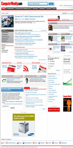
Because I like doing things on the back of a packet of fags (or a nicely printed out version of a page), lets start by taking the page in question. In this case it is the home page. I’ve screen grabbed it, plonked all the bits together as best as I could and then saved it so that I can print it out easily on one page:

One of the important things to remember with this page is why we built it and how we built it. So lets go all the way back to our initial wire frames and look at the reasons that we positioned certain things in certain places.
The next thing to do with this page is work out little boxes, using your wire frames and using your initiative of things that are related on the page. You’ll notice on this page that I haven’t grouped everything and some of things that I have grouped we may not be able to tell whether they have been clicked on anyway (I’ve missed out ads, polls, buttons, etc).
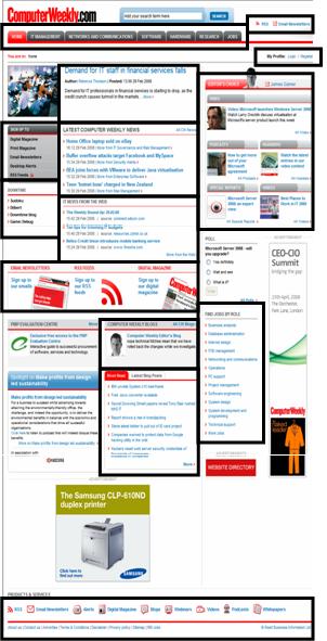
My recommendation is that you print this out, put it on a desk, get a big red marker and start counting how many clicks are on each section. If you’ve had enough foresight to realise that you are going to be doing this exercise, you can make sure that each link has a unique id (HBX), query string (Google Analytics) or however your site overlay product distinguishes between links. If you haven’t, then you’ll probably realise that some of the links appear more than once on a page (eg more…).
- Ok there was a reason that we had the top nav like that – we think our users are getting a bit more savvy with the web and understand how top navigation’s work. We can look at our personas and understand how people are intending to use them, but lets be frank – this navigation is the same across the site. It has to be. That is what people expect. Finding out that one is more clicked than another on the home page is irrelevant to us because that is only a small percentage of the people. However finding out that people are clicking on it suggests that the content on the rest of the page isn’t specific enough for the users (or they don’t understand it). This is why I have grouped the whole navigation into the top box.
- Secondly in the top right we have our users profile details. This is fairly standard. What it does is irrelevant – if it is going to be anywhere this is where users expect it to be (or in the top left next to the site name – but it is fairly clear in this case and we have the search box up there). We also how our email newsletters and RSS feeds. These are a bit more specific (hey they are on the page 3 times) and relate to the Business goals that we gave our users in the personas. We wanted to get our regular users to sing up to these because it gives them better engagement with the brand.
- We then have our main headline (chosen, rather than scrolling through latest). Again think back to the personas and the reasons why we have given this top spot (with a nice picture). We want to showcase our best content and this is the perfect opportunity
- We also have a load of ‘news needers’ for want of a better phrase who come to the home page purely for news (get them signed up to RSS and email!!!) who just want a box with the latest news. We’ve also given them options to link through to news about specific subjects. Does it work? Look at the site overlay and work out whether it does or not, but in this case I’ve grouped them in.
- Right hand box then shows the Editors choice. This is an extension of the main headline, but should include the best content. These are the things we are using to keep our first time viewers on the site. These are also the things that one or two of our personas said that they wanted – expert content to help them with their job.
- News from around the web was actually something that we decided that our users wanted based on our own business goals and the interviews we set up for the personas. We know that users like to have a ‘hub’ of information, so lets make it ComputerWeekly rather than getting ComputerWeekly linked to on other hubs. Usage of this may appear that we are driving visitors away from the site, but it should have a legacy metric of encouraging users to visit more often (Loyalty Index anyone?)
- We have our sign up on the left hand nav – deliberately made more explicit in what it offers (separate links for digital and print magazine). These were another of the things that the users said they wanted to be able to do more efficiently
- The ‘Downtime’ is an important area of the site for many users. Giving them the ability to easily get to this fun section will stop them hunting around – this is the sort of thing that you should be able to check with your internal search analytics
- We have another big Sign ups box across the middle (pictures explaining what they are)
- We have a section pushing our blogs (user generated content was something many personas said they were keen to see)
- Jobs by role is one of the most important parts of the page. This is a section that many users said that they visited. ‘Jobs’ in the tool bar is one of the most clicked on links in the top nav, so lets have a section of more detailed types of jobs
- Most read is something that every user expects to be able to see on the site. It will show the users what other users are finding interesting (and hence maybe they should be too)
- Bottom nav of products, terms and conditions, frequently asked questions, etc. This is something every website should have at the bottom, just in case someone wants to know.
Ok so we have our page on a piece of paper with big red markings on it sitting in front of us. We have our list of items on the page and why they are important. Lets look at the two of them and work out if they are each working or not.
Is one getting many clicks? Yes? Is it is in the best position for that option? Are they clicking through and then giving up because it isn’t what they thought it was going to be. Remember that this is a page flow and you need to consider what the user is doing on the page afterwards. Is it because we’ve done a good job and the users are happy?
Is one section not getting any clicks? Well why is that? Is it because it is not very well placed? Is it because actually the user is finding it somewhere else. Is it actually because whilst the users claimed it was important when asked, actually they don’t want to click on that bit, because something else is more important. Consider moving it to another point in the journey.
Consider each element carefully and whether it performs its function on the page. Amazon famously give each of their rolling ads on the home page only a limited time until the point where something can make more money. Stop making a certain volume of money and they are taken off the page. And by limited time I mean minutes.
Leave a Reply