Traffic for Whencanistop
I thought that in this post I might share with you some information on the amount of traffic I’ve been getting to this blog and give you some insight as to how it works. It should give you a good idea as to what is happening and how I look at my own traffic, having described how to check yours you can see if I am doing it right. More than that, I’ve just signed up to Gatineau (or Microsoft Ad-Centre Analytics as it now seems to be known) so I’ll be able to tell you a bit more about it in the months coming up.
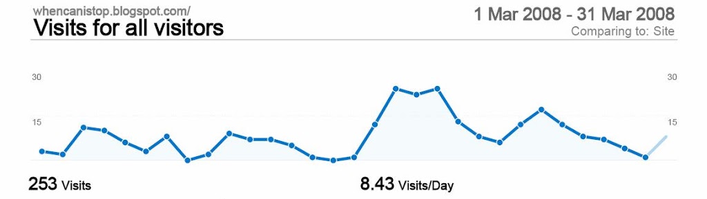
Ok in March I had 253 visits. Averaging 8.43 visits a day, so Google Analytics tells me. Don’t believe me? Well here is the graph that says that it is right:

What does that mean? Well lets look at it in a slightly different way, in February I had 86 visits and in January I had 142 visits. So it all looks good for January (January is always great for traffic don’t forget) and then goes a bit pair shaped in February. This leads to the question of why this is happening.
Well first step is always to drill down into where people came from. Lets look at January first because it was large. In January I had three big landing pages and using Google Analytics I can drill down into each of these to have a look at where they peaked. Firstly I have the 6 tips for using Hitwise:
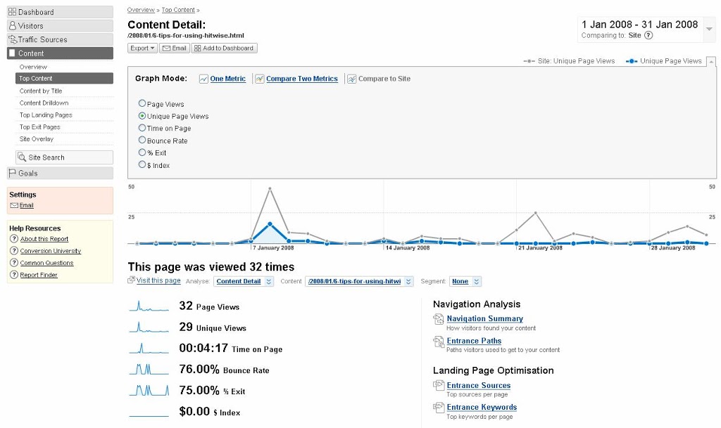
As you can see from the graph, one of my big increases in January traffic was caused by this page. Where did they come from? Well in this case I know, because it was an email sent out to our editorial team telling them to read it. You can tell because if you drill down to ‘Entrance sources’ on the right hand side you can see that.
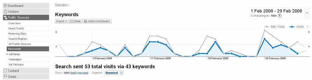
So we can do that for January, but what about February? I only had one real big landing page and that was fairly frequent throughout the month. In this case it is slightly more interesting because the article was written in January and was about Omniture buying Visual Sciences. So why did it have loads of traffic – this time if you drill down to entry sources we see that this actually got most of its traffic from Google. What we need to do next is to drill down even further in here and look at the keywords and rather unsurprisingly there are a lot of keywords with Omniture and HBX in them. But 51 keywords is a lot for just one page.
So here we can now see that most of the time that I was getting lots of traffic, it was coming from Organic Search. However we should also look at the other referrers and see if there was anything significant in there. Well there were 17 directs and a few from other sites. I should probably go to those other sites and say thank you, maybe leave a comment or link to them from my blog.
Well March is much different. Traffic is much higher. To the naked eye, there was a big increase in traffic around the time that Kate started blogging on SES New York. And actually if you look at the traffic the amount of entries for Kate’s take on people being cats and not dogs is around about the same time that I had an increase in traffic. But remember that compare to site functionality because if you do that, it shows that Kate’s articles were not the main driver. Lets not get carried away here, those articles have been well read – the cats and dogs one is the fourth most read article on the site in March.
Lets look elsewhere then. The top post was still the article from January about Omniture and HBX. That didn’t really peak at any point throughout the month. The home page itself was a bit landing page, but again that didn’t really ever peak. The conversion funnel analysis also was in the top three, but that was an old story, so didn’t really peak either.
Lets go back to our top 5 tips. Tip one is to look at where people came in to. Tip two is to look at where they came in from. That is much easier – drilling down into the referrers report leaves me to see that whereas in February I had 53 visits from Google, in March I had 149. And those 149 fairly follow the peaks and troughs of my overall site traffic. Good stuff, well optimised content. Lets drill down and see if we can make out why.
Looking at my Google Landing pages shows that I had 30 different pages which people land on. That’s surprising because this is only my 30th post. This is where our macro analysis begins. See that url at the top? Its folder structure contains the date that the post was published. Lets drill down into this a bit more – if you look at the top landing pages from Google they are almost all Jan or Feb 2008. Three out of the top ten are March 2008. The top 3 account for about half of the visits, so I am getting a long tail. How do you get a long tail? Writing articles on a fairly regular basis, linking between them in a good way helps. Also making sure that the labeling (or tags) that the post have are well related also helps. No golden bullet on this one I am afraid.
It also helped that in March I got some traffic from the Search Engine Strategies blog (thanks again Kate), not to mention James Kelway’s Userpathways blog. Overall a good month and I am hoping that April will be better!!!
Finally, the last thing that you should always do is check out those locations. Most of them came from the US (that’s not surprising – that’s where most web analytics people are). And particularly actually from New York (thanks for promoting me at SES Kate!!). The second on there is the UK (that’s where I’m from, so most of them are probably friends). But actually there are about a fifth of the visits coming from elsewhere. Australia and Germany leading the way at the moment.
Leave a Reply