Web Form Design
In an uncharacteristic change, I’ve been reading some non-fiction on the train to work in the last couple of weeks and thought I’d blog about it here (albeit briefly) before moving on to some related web analytics stuff. The book that I’ve been reading is Luke Wroblewski’s Web Form Design. It is a very practical book on the all the intricacies of designing and building forms for the web environment. And to be quite frank, I didn’t even realise that there was so much to know about. What I’m going to do here is do a brief bit on what is in the book and then some more web analytics stuff afterwards (which isn’t really covered in the book).
Rather than go through the book in complete – I thought I’d share the bits that caught my eye particularly.
Clear Scan Lines:
Firstly Luke has clearly done his research in this area. He has done a lot of work in the past and studied other website’s forms to see how they change. More importantly he has done lots of eye tracking studies. Through this eye tracking studying Luke has established that the best way to build forms is so that users can scan their eyes down it easily. This means getting everything justified in the right way to give users a straight line down the page.
The advantage of this is that the user doesn’t have to move their eyes around the page to find all the input fields and information that they are after. This should help them complete the form without missing out any elements (which is a common reason for users failing to complete a form). It will also give the user a flow from the start to the end, finishing up on the submit button, rather than zig zagging around and trying to work out which they should do first (the left hand column, across, etc).
Label Alignment
I didn’t think that having labels aligned left, right or above would make any difference to how a form is perceived, but apparently it does. How do we know? Well Luke has been looking at his eye tracking again and more importantly there are advantages of each system. Sometimes you need right aligned to make it obvious which field goes with which label. Sometimes you need left aligned to get a better scan line (people read from left to right). Sometimes above is better because then it is obvious what the fields are for.
Help Text, Errors and Success
These are the three things that I think are most commonly overlooked. How do you tell people how to fill in a field, how do you tell them they’ve done it wrong and how do you tell them that they have been successful. These should be important bits of the design process and need to be thought about thoroughly. Help text should be short and concise. Out of the way for the user who doesn’t need it. Think about how the labels are set up – if you need too much help text, the question probably isn’t obvious enough.
Errors on the other hand should be the complete opposite. It should be bold. It should be red (nothing else on the form should be red). It should point out what is wrong and how you can fix it.
Success pages should be short, sweet and helpful. You should tell your users what the next steps are now that they are have spent their valuable time filling in the form. You should give them some other options of things they can do in the mean time whilst whatever it is they are waiting for arrives. You should tell them how long it will be until it arrives.
Selection Dependent Inputs
I think Luke could have written a whole book on this subject. He provides a fascinating look into which method of revealing selection dependent inputs looks best and works best in a set of situations. Whether it be Vertical tabs, horizontal tabs, drop down lists, exposing below radio buttons, exposing within radio buttons, exposing just the active setting or exposing the whole lot and then just selecting the active one. I think I could probably blog about it too forever, but without any real examples there is no point.
A/B testing
One area I think that Luke could mention in a future book is A/B testing. One of the advantages of the advanced web analytics tools that we have now is that we can put two different forms up onto a page and work out which one works best in an A/B or multivariate test. The advantage of this method over the eyetracking is that you can find out what large groups of people find the easiest form to complete and get through to the other side.
What I always suggest with A/B testing though is that the research is done thoroughly beforehand. It is far too easy to start at the wrong base point and end up at a version which works the best given the starting design, but isn’t the best form because the wrong route was taken early on.
Funnel Analysis
My favourite topic (and I’ve mentioned how to do conversion funnel analysis before) here. The reason that I am so keen on it is that I am a strong believer that like suggesting that you do research before you start your design process (and A/B testing) you also do your funnel analysis before you start your research. The advantages of the funnel analysis are that you can work out the points that your site is failing you much more easily through this route and use this information to feed into your research. Doing lots of research on a form to get a 5% increase in conversions is nothing if it turns out you could have done some research on an earlier part of the form that would have given you 20%.
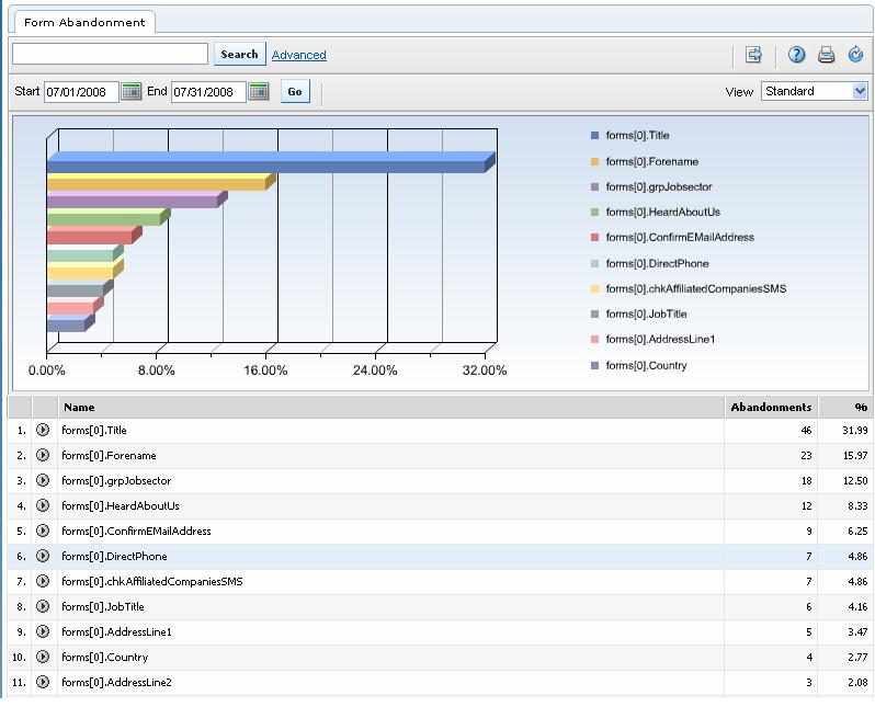
Form Abandonment
HBX has a great form abandonment section that will tell you the point that a user gets up to before they quit the form and go somewhere else. It’s in your pages menu, second from the bottom. You’ll have to search for the particular form that you are looking for (especially if you have site search running). But when you do, you might start to find some interesting information. For if you click on the little grey button next to your form page and choose ‘form abandonment’ you can see the last field the user got to before quitting.

- Does this field need to be on this page?
- Should we give some help text to explain what to enter into this field?
- Should we give some help as to what format it should be?
- Should we give some explanation as to why we are collecting this?
- Should we tell our users beforehand that they will need to know this to get through our form?
A bit of food for thought there on ways to improve your form. If you are going to do any form redesign or analysis, I recommend reading Luke Wroblewski’s book on Web Form Design though – it will give you lots of ideas on the best ways of creating them and may give you some approaches that you hadn’t previously thought about.
The HBX form abandonment screen shot is incredibly powerful. How can you do that using SiteCatalyst?
I just discovered your blog and it is very useful with a lot of great content. Keep it coming.
Dave Nelson
Hi Dave,
Thanks for the comment.
SiteCatalyst doesn’t have any web form analysis out of the box, but there is a commonly used plugin that you can use which does similar things to the HBX one.
It is a plugin that you put into your s_code (javascript file) and has a bit of jiggery pokery with the form itself. But it will show you which field the user abandoned on, whether they were successful and any errors thrown up (eg incorrect entry into a field, or missing a require field). This all sits in custom conversion variables, so you can tell if users went on to complete the major conversions on your site (sign up, lead generated, sale, etc).
Drop me an email if you want to know more!
Cheers,
Alec