6 visualisation techniques for post number 100
Wow, who would have thought it? Almost three years ago when I started this thing I was sure that it was going to be a short little thing that would get no traction whatsoever. But here we are looking down the barrels of post number 100. And what a roller coaster it has been. To celebrate the 100th post I am giving away a blog post about visualisation techniques that will change your life forever (ok for about the three minutes it seems to take people on average to read my blog – no really, I measure it). If you’ve read all 106,821 words that I’ve written so far, then you will probably not be too surprised by the rest of this. Most of these are going to be things from Google Analytics, because I’m going to try and show you how many people are looking at this blog.
1. Line graphs
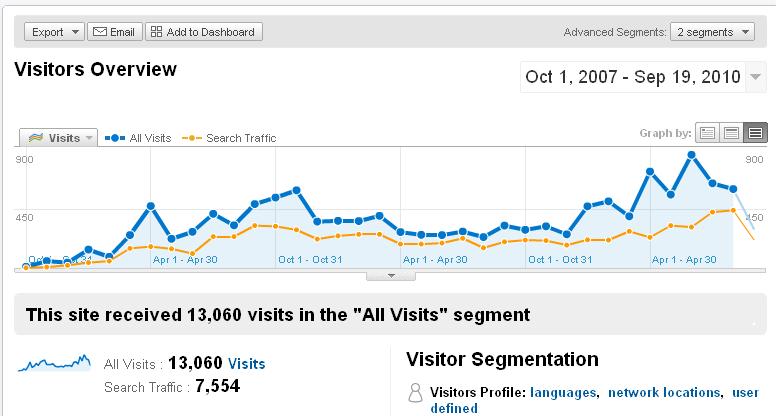
How can something so simple, by so applicable in so many situations. This is one area that Google Analytics does much better than SiteCatalyst, because it is an automatic time sensitive graph that is loaded at the top of every screen. You can then drill down to each of the elements and still have the graph (ok, you’ll probably have to export into excel to do any comparisons). SiteCatalyst on the other hand isn’t great for totals and it is annoying that you can only graph five elements at a time. However you do have to change view to get to that trended option.

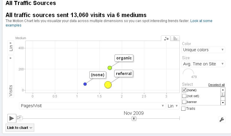
One of the things that I like doing is overlaying a segment on my Google Analytics posts. In this case, you can see how my organic search traffic has been steady (with a nice increase in the last couple of months) despite the erratic total visits.
2. Treemaps
These are my favourite types of visualisation techniques and one of the reasons that I was thrown by Microsoft’s Gatineau (until it was renamed and then canned). Fortunately not all is lost, as pointed out by Avinash recently you can do something pretty similar in Google Analytics if you have access to the API and are a bit handy with the developer software.
Personally I noticed that XCelisius 2008 was on a free offer recently and have downloaded it to play with. It’s a relatively nice bit of software, even if it is a bit unreliable with Excel 2007. What it does have is the ability to create treemaps, although I was slightly dissapointed that the only way of presenting them was to upload them into a spreadsheet and not to put them live on the web (I’ll save it and link to a live version later).
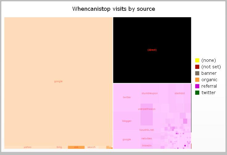
Particularly I was excited by the way that you can map a nice metric (like the one above) into various different boxed and then make it interactive so that you can find out more information about them. Above I have an example of how my site’s traffic from the last 3 years splits in terms of where the users come from. That big block in the top right is the direct traffic to the site and most of the big block to the top left is Google. Interestingly the pink the bottom right shows how some of the more niche sites have a better traction with the site than the bigger ones (darker pink is more page views per visit)
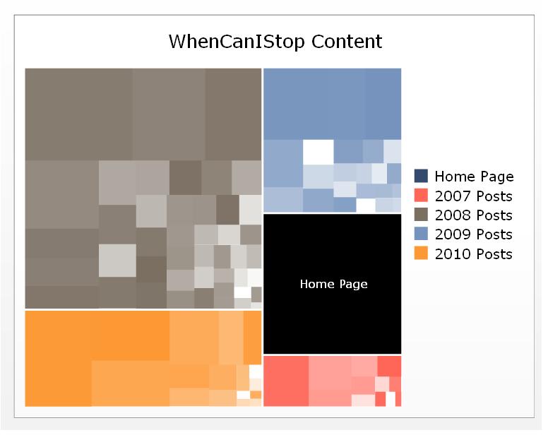
In the next example I haven’t written any post names on, but these are my blog posts by years that they were written. It’s interesting to look at to see how my 2008 posts seem to have attracted more visitors than 2009 (well they’ve had time to), whereas 2010 is going really strong. But they all completely dwarf those visits looking at the home page (are you looking at the home page now?). Even though this doesn’t really give that many actionable insights, one thing it can do is show you which areas you should concentrate on for improvement.
3. Maps
Ok, so you’ve got a view of your content based on how many people look at it, with different shades for how many pages, why don’t we do the same thing for where they are in the world?
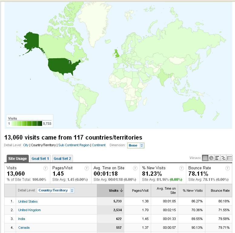
This does start to beg the question though, is this good or bad? What does it mean I should do? Is it significant that there are so many more people in the States looking at my site (that’s the darkest green). What could I do with this. Well one thing you will have noticed is that I try to avoid doing things that are British English. Uses of the word ‘colour’ (or ‘color’) are suspiciously absent and I don’t tend to talk about trends of things that are happening in a country too often (although, obviously occasionally).
Also, what is up with Greenland? Seriously you guys, start reading my blog.
Why are dashboards such an emotive subject? Well everyone (and I do mean everyone) wants them to do something slightly different. Your dashboard will never satisfy anyone, let alone everyone. So your job as an analyst is to come up with something as simple as possible. This is why the XCelsius product is good (in a way).

And I still haven’t mentioned Google’s new weighted search feature. Who’d have thought it.
Congratulations on #100 Alec, that is a great accomplishment.
As they say here in the US… 90% of winning is just showing up consistently. : )
The six visualization techniques are great. I am personally disappointed that more web analytics vendors have not embraced tag clouds and other such “non table” “non line graphs/pies” techniques. Hopefully we’ll see more innovation in that space.
Congrats again!
Avinash.
I am glad you said that..
Thank You,
Norma