The four types of web analytics Presentations
I’ve just been asked to do a presentation at the end of the week that made me realise that there are four types of web analytics presentations. I thought I’d run through the four types and give my hints and tips (not that I am expert or anything). I also thought it would be interesting to talk about it, because it will give some insight into the different stages of the job.
1. What is web analytics?
This will be a common one (I would have thought) across the industry. “What the hell do you do?” seems to be the burning question on everyone’s lips. This is especially common at the beginning of life at your company. Nobody has been doing analytics before, everyone is kind of wondering why they’ve brought (bought?) someone in to come and do something that they didn’t need before anyway. This is the one that needs to capture a bit of imagination. I always think this falls into a couple of groups:
- Brief 5 minutes in front of 50 people – this is almost a pitch to your peers to make use of your time by describing how you can help them do their jobs. These are difficult – you need to be interesting, you need to get the point across and you need to make sure you don’t generate too much work for yourself. Tips for this sort of presentation – talk about the process being a cycle. Get your best picture of a circle and talk through the optimisation process – have a look at Brian Whaley’s post (it’s about development, but the same cycle applies). This will encourage everyone to realise they aren’t at the beginning of the process and you won’t have to deal with them all at the same time.
- Longer (10 – 20 minutes) to a smaller group explaining why you are worth investing money in. These are more difficult. You have to be able to clearly explain why the work that you are doing is going to make them more money. They are probably the ones who are going to have to spend the money to accumulate it in the rest of the Business. Yes, yes, I know it is valuable. Yes, I know it is fairly obvious. But this hasn’t always been taken for granted. Here you need to be very clear about the role and define what you are going to do. Explain how the campaigns that are making money at the moment could make more money. These are good places to point out spend on marketing (particularly online). Put graphs in showing the increasing spend. Research well. Don’t have too many slides and fancy presentations.
- Longer versions, but to a bigger group explaining where it all came from. I’ve done this before – it is fairly dull. Nobody cares that we’ve only been doing it in total for 10 years. Nobody really cares about log file analysis from the early 2000s. Get audience participation. Get them to vote – give them examples of how the system used to be that whoever shouted loudest got the job done, but now you can test your theories with proper figures. This is a real – lets get interested in numbers and show that really we’re too close to the product to make decisions, so we have to be use centric. Lots of slides. Lots of pictures. Pictures of babies I always find work well (everyone goes ‘ahhh’).
The key to these presentations is that you need to get across that the numbers will help with the decisions that they are going to make. All you are doing is helping them make sense of those numbers.
2. This is an analysis of your site:
These seem to be the most common ones for me at the moment – which is good. I like these presentations – usually you are showing them something that is fairly straightforward, but from an angle that they haven’t previously thought of. I always think these presentations should have a bit of a format and it goes a bit like this:
- General traffic figures
- What has worked well
- What isn’t working so well
- Recommendations
The first three of these are really good, because your presentation should be very basic. Get a slide with a graph on it and one or two bullet points.

These graphs should be simple graphs, that they could replicate themselves if they logged into the analytics package. I’m not suggesting that you won’t be believed, but if someone wanted to check again in the future, you should have clearly labelled what is in the graph.
Recommendations are the key to this type of presentation. The outcome of the analysis should be actionable, so giving your recommendations on what you would do to improve the site and further the business should come. I like to put my recommendations in my bullet points as I go through and then summarise at the end.
3. This is how you use your analytics tool:
Not really a presentation as such, but sometimes I like to give it as one. This is a situation where you’re having to teach a group of people how to use the web analytics tool. It’s usually not as simple as that – it’s fairly easy to use the tool, what you are doing is teaching them how to interpret the results and what to do with it when they’ve got the data.
I always think that these presentations are completely different. Why? Because your teaching as opposed to presenting, mainly. And this gives you the big difference – they are going to have to go away and do it for themselves. That means that everything you do has to be very simplistic, step by step co-ordinated and have an example for use as well. I find that at the end of these presentations people as for the presentation, so you have to clearly explain how you got through each step.
A good point to start in these presentations is a standard set of definitions. These should always relate to firstly what people see them as (eg a visitor is a person) and also what it really relates to in the real world (its a browser with a cookie on it). This starting point gives the presentees (is that a real word?) a place to go back to if they are trying to do something. Whilst you may mock and suggest that everyone knows what a page view and a visit are, they may not know the terms that you have created for your campaign responses, what bounce rate is and what conversions relate to.
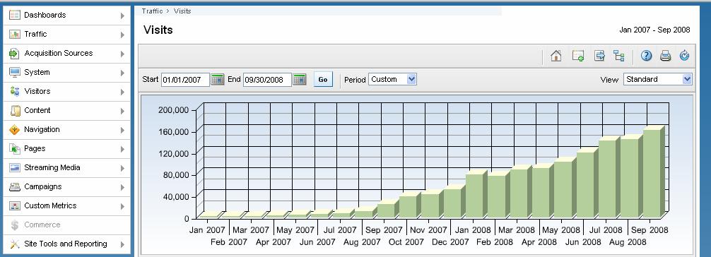
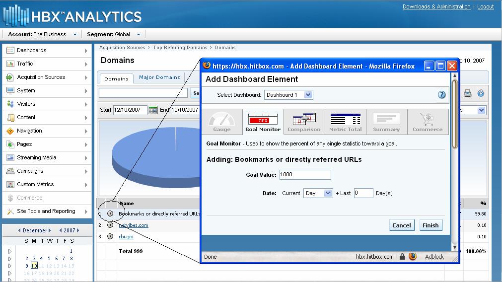
Another thing I have found that people say is useful is either a description on how to get to a report, or an image showing it so that the user can find the report that you’ve suggested they look at really easily:
This report doesn’t need to contain recommendations – it should be as concise as possible, but remember that it is going to be passed around afterwards, possibly to people who weren’t at the original presentation. Include your name and phone number so that you can be contacted afterwards.
4. This is your traffic:
This is the most recent type of presentation that I’ve been asked to do (I keep thinking for the first time, but I’m sure I’ve done so before). There is going to be a big gathering of people from a department and they want you to tell everyone how it’s going. Very general, not easy to do. The keyword for this one is Charisma.
This is where you need to have jokes lined up, interesting facts and something that is slightly different. A unique selling point for your presentation is probably a key. I like to use running gags, so I try to use something right at the beginning of these that I can then use throughout the presentation. Liken your first set of graphs, results, etc to something that you can then use throughout. Abstract metaphors can sometimes work.
The other thing that you need to really consider here is the audience. Who are they? What do they do? What can you do to show them what they do is really important and that you are monitoring it.
Another thing to put in these presentations can be some of the challenges that you or the business is going to be facing. This could get your audience thinking about how they can help you overcome these challenges. We’ll find out later in the week whether I know what I am talking about if it all goes well!!!
Looking forward to seeing some of that charisma in action!